
Creating components with Angular is a bless. The API to declare inputs and outputs is clear and simple. View encapsulation makes sure that styles don't leak outside of the component's host. However, there is one thing that is not clearly defined by the Angular framework: providing an API to let consumers customize styles of a component.
You can of course achieve it by setting up inputs. You would have to declare the inputs and put inline styles on elements inside your component. You would also sometimes have to use @HostBinding to attach styles to the host element.
The alternative I suggest in this post is making use of CSS custom properties, also called variables. If you don't know what they are, there is a great page about this topic on MDN's website.
Let's directly have a look at an example of a card component. It has a title and projects content right below it.
<h3>{{title}}</h3>

<div class="content">
  <ng-content></ng-content>
</div>import { Component, Input } from '@angular/core';
@Component({
selector: 'app-card',
templateUrl: './card.component.html',
styleUrls: ['./card.component.css']
})
export class CardComponent {
@Input() title = '';
}:host {
padding: var(--card-padding, 10px 10px);
border: var(--card-border, 1px solid grey);
box-shadow: var(--card-box-shadow, 1px 1px 4px 1px grey);
display: inline-block;
}
h3 {
color: var(--card-title-color, black);
padding: 0;
margin: 0;
font-weight: bold;
font-size: 16px;
}
.content {
margin: 5px 0;
font-size: 12px;
}The last CSS file is where we enable CSS customization. The card component uses a few CSS variables --card-padding, --card-border, --card-box-shadow and --card-title-color. You can also note that we provide fallback values with the syntax: color: var(--card-title-color, black /* <- fallback value */ );.
Let's now have a look at how one can consume the card component and customize its style.
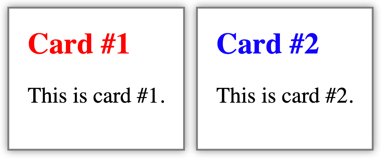
<app-card [title]="'Card #1'" class="card-1">
  <p>This is card #1.</p>
</app-card>

<app-card [title]="'Card #2'" class="card-2">
  <p>This is card #2.</p>
</app-card>app-card {
margin: 3px;
--card-box-shadow: 0 0 4px 0px grey;
}
app-card.card-1 {
--card-title-color: red;
}
app-card.card-2 {
--card-title-color: blue;
}Our application template declares two cards. Each receives a CSS class. In the CSS file, we say that the --card-box-shadow of the cards should be 0 0 4px 0px grey. .card-1gets a red title and .card-2a blue one.
CSS variables, or custom properties, act like other CSS properties: inheritance and specificity rules apply the same way.
You can also define CSS variables for the whole application by using the :root selector.
:root {
  --card-box-shadow: 0 0 4px 0px grey;
  --card-title-color: red;
  --card-border: 1px solid grey;
}This technique enables developers and consumers to keep concerns separate: what is relevant to styling stays in CSS. It is also an elegant way for library creators to give more customization capabilities to their components.
KM
Photo by David Pisnoy on Unsplash